One area of HCI I’m getting most excited about is visualization research, because of my interest in the design of fitness/training applications for remote athletes. When I started thinking about this area one question I had right away is what visualizations are best? That is, which are most accessible, quick to read, and convey the most information in the least space?
In fitness and habit tacking, the most popular visualizations I have found are bar charts and radials. So one question that I immediately had was how good are these two visualizations? That is, which conveys quick information, can support a large number of data values, and is most accessible? There is a rather recent paper that answers the first question:
T. Blascheck, L. Besançon, A. Bezerianos, B. Lee and P. Isenberg,
"Glanceable Visualization: Studies of Data Comparison Performance on
Smartwatches," in IEEE Transactions on Visualization and Computer
Graphics, vol. 25, no. 1, pp. 630-640, Jan. 2019, doi:
10.1109/TVCG.2018.2865142.
Find it here: Blascheck et. al 2019
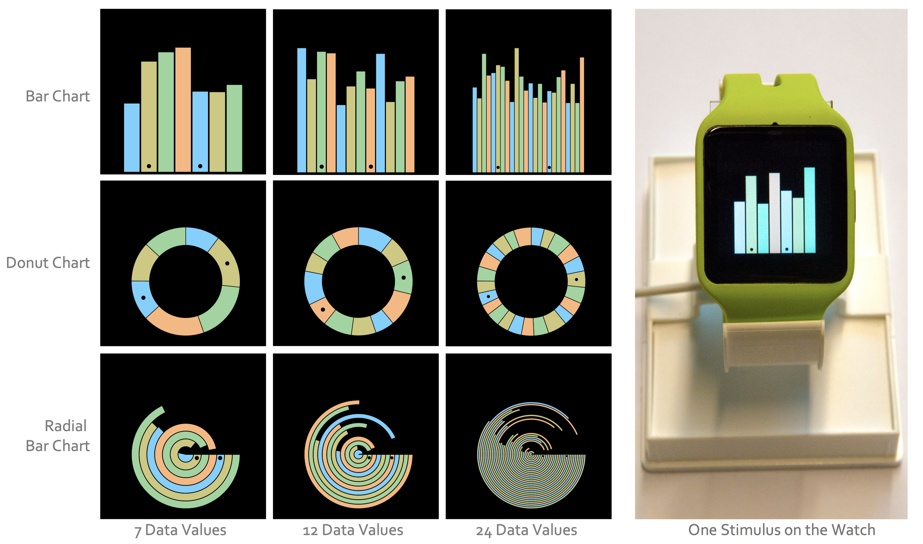
On the left you will find a three-by-three gird of several styles of charts (without labels) in various colors. There are three styles of charts given: bar, donut, and radial. Each chart is presented with three data values of seven, twelve, and twenty four. Bars within each chart that are the stimulus in the study are marked with a black dot. Finally, an example chart on a smartwatch is depicted to the right of the grid. This image is from p. 2 of Blascheck et. al 2019.
This paper is great, and reading it got me super fired up! So naturally, I wanted to write up a quick post on it. They describe their study in full detail, provide their own critiques, and propose and hint at a lot of open questions. All the markings of a great paper!
Overview
The main research question of the paper is:
RQ: Which chart type offers the best speed when comparing multiple data values on the screen of a standard smartwatch?
The chart types, bar, donut, and radial, were chosen based on an analysis of the top most popular activity tracking apps on the Android store. Their analysis also found that the number of data values visualized in the various charts in the most popular apps were seven, twelve, and twenty four (due to their relationship with days, months, and hours).
They then designed a multi-phase study to answer the RQ.
Study
One of the things I loved about this paper was the thoroughness of their explanation of their study especially in its design, results, and critiques. As a budding HCI researcher and practitioner these types of explanations are extremely educating and helpful. They cite several of the articles that introduced their design choices which, again, helps me a lot as a student.
Their study had three main phases:
- Pre-study
- Main study
- Followup study
Pre-study. To figure out the right parameters for their study they conducted a pre-study (a great idea). This was a within-subjects study with one factor to figure out the most common viewing angles and distances people use while reading and interacting with a smartwatch. Participants, twenty of them, wore the smartwatch and a bike helmet with attached sensors for reading pitch angle, distance, and line of sight offset. They were then able to take the average of these to find the most common parameters.
Based on the results of this they created an apparatus to hold the smartwatch during their study at the optimal position. The participants would then interact with the smartwatch without moving it.
Main study. The purpose of the main study is to find a minimum time threshold participants would need to complete a simple data comparison task on the various visualizations of bar, donut, and radial charts. Their study design followed an approach from psychophysics (a subject with a cool name that I had no idea existed) called two-alternative forced choice (2AFC) design which is used to assess the perception of visual stimuli.
This design technique asks participants to select one of two options given to them. Here the participants were given the choice of two target values shown on a particular chart with a particular size, and then asked to find the larger of the two values. The two values are indicated on the chart with black dots superimposed over the bars of the chart.
They used a stimulus exposure duration to be able to study the average task duration. That is, the stimulus, the chart, was shown to the participant for a certain amount of time. Then they used a staircase method where the exposure time of the stimulus is decreased with correct responses, but increased with incorrect responses.
One question one might have is what is the starting duration? They figured this out by conducting a pre-study on themselves and then scaled that duration up 1500ms. I think this works, but I wonder if it is a bit fast, because of their experience with their study design? Perhaps asking some random students would have been better.
All of the data was random generated, but they did carefully design the charts themselves. They found that the tasks were quite difficult when there was no coloring coding, and so they adopted one, but they did use a colorblind-friendly pallette. There were no labels on the charts, and the black dots were at the bottom of a vertical bar and the center of a horizontal bar (for the donut).
Followup Study. During the main study the authors found that participants were using strategies to try and guess the correct answer quicker. In addition, the bar heights in the main study were not as diverse as they would have liked, and they experienced networking problems centered around using UDP to communicate between the smartwatch and a computer for logging. So they conducted a followup study to double check their results. Largely, their results held up against this study as well.
Findings
They obtained some interesting results from their study that I personally was surprised by given the popularity of various charts on mobile devices.
For a small number of data values there really isn’t much of a difference between each chart type. However, as the number of data values increase the differences become more apparent. In fact, as it turns out there is essentially no difference between bar and donut charts at any number of data value (in the main study they found a very small difference, but in the followup study they found no difference), however, and this is where I was surprised, radial is outperformed at every aspect by bar and donut. This is surprising, because radial is found all over the place in mobile applications. Just look at the Apple Fitness app or any sleep tracking app.
Critiques
I do have a few critiques. Most of the participants have a technological background in either HCI visualizations or computer science. In addition, the number of participants is small. I think this study could be done online using a simulator and allowing the participants to move around. I also think the within-group design creates to much uncertainty here, because participants get fatigued after too many tasks, and they start to learn new strategies for completing tasks (the follow-up study did address the latter though). Perhaps a between-group design would be better given the large number of tasks.
Future Research Directions
Personally, I would love to see this one repeated on mobile phones. It turns out the first and fifth authors did repeat this study, but on laptop devices:
Blascheck, Tanja, and Petra Isenberg. "A replication study on
glanceable visualizations: Comparing different stimulus sizes on a
laptop computer." IVAPP 2021-12th International Conference on Computer
Vision, Imaging and Computer Graphics Theory and Applications.
SCITEPRESS-Science and Technology Publications, 2021. DOI :
10.5220/0010328501330143
They switched from a within-group design to a between-group design. They also consider chart sizes: small and large. They choose a laptop that has a similar resolution to the smartwatch. Finally, all their results hold, and radial is still outperformed. However, the bar chart is preferred most by the participants, but when asked the same question during the smartwatch study, the participants preferred the donut chart. This is interesting, because it shows that device (the medium) matters!
I find it interesting that the authors went from smartwatch directly to laptop, and not mobile phones first. It is true that some of the results from the laptop study would transfer, but the largest size they use would not. So I wonder if the results would hold still, and I wonder about the participant preference given the heavy use of radial in mobile apps.
An interesting spin would be to take a population of fitness users and see which they like most, and how they perform over the various charts. Is there a bias towards radial there?